When you deploy some code, do you know its impact on your production stats, like memory usage, request duration, error rates? If you wanted to know if your code improved or deteriorated the speed of SQL queries, would you know where to get this data?
We collect a lot of metrics in production systems, but we usually set alerts only when these metrics cross a hardcoded threshold, which is often somewhat randomly chosen. But most often metrics don’t go “unhealthy” overnight, they are usually slowly pushed towards the threshold for months before they reach the threshold.
Wouldn’t it be great if we could detect these changes soon after a code change is out rather than 2 months later?
Welcome to the wonderful world of automated health detection, where we teach Python to answer the eternal question: “Does my code have undesired side effects?”
In this post
A Quick Confession
I’m not a data scientist. I don’t have a PhD in statistics or in math. I’m just a regular Python developer who, one day at a small startup, heard the words: “Wouldn’t it be neat if we could automatically detect when deploys deteriorate production? Not directly break it, just degrade our memory or CPU usage.”
And like any reasonable person, I said: “Can I try solving this?”
What followed was weeks of reading Wikipedia articles about statistical methods, that I was repeatedly told we did learn at university, but that I swear I never heard of before, and a lot! of trial and error. But ultimately all this work resulted in a functioning system that has been running in production for many users for many years now. And every time I check it, it seems that its decision on what is a deterioration and what isn’t, makes sense.
The point is: this isn’t rocket science, and it is not reserved for machine-learning engineers. It’s just Python and a few strategically placed math functions.
Let’s dive in.
The Problem Part 1: Too much data
Modern systems emit lots of metrics every minute, and we are eager to store them all. The plan is to first catch them all, and later we’ll figure out what to do with them.
But we don’t truly know what to do with most of them.
Often we look at charts only after an alert has fired. Which makes sense, because an alert really invigorates our ability to make heads or tails out of these charts.
Outside of alerts, those charts are just really hard to interpret. And also really hard to explain to bosses: “You see that slight kink in that CPU chart? I think that could be a bad thing, or it is just weird user behavior. I guess we should wait and see… but can I still get some time reserved to watch this?”
What is a good level for CPU usage for instance? Google says it should be 40%–70% and if it is “constantly” over 80%, we should provision a new instance.
But why is it suddenly “constantly” above 80%, when it used to be consistently below 60% even 2 months ago?! What did we deploy in the last 60 days that could be causing this? Or is it just that we have more users or are the users behaving differently?
The chart does show that the values have been growing for some time, but nobody noticed until now. But “now” it is much less work to just provision another instance than to find the culprit.

The Problem Part 2: Production is noisy
The data also doesn’t follow clean, simple patterns. The data shows, seemingly, random outliers, and it flows up and down with user usage.

What is the pattern here? What is the normal?
Is the value at 70 a spike? Is it a bug or just a user who wants to download too much data with 1 click? Or is it a faulty SQL query that is accidentally joining too many tables?
The thing is… there actually is a very simple and foolproof way to make all your metrics the most healthy. Just remove all users. Your CPU usage will never go above 80% if you have no users, your memory will never spike, you will see no errors in Sentry, no incidents for miles and miles.
But we don’t want “no users”. Which means we can’t have 0 errors and 0 incidents all the time.
So… how many errors are then ok for our particular system? Users come and go to/from our site, so we have to accept spikes as a fact of life.
The Goal: A system that can learn from the past
The goal is to build a system that can quickly be trained on our past data (quickly as in: a few milliseconds) and that can make a judgment call on new metric values, are they “healthy” or “unhealthy”?
Work on this system started in 2020. No LLM was used in this project :-).
The curiosity in me would love to see this project re-written to use LLMs, but that would make it crazy more expensive to run and I wonder if any LLM can realistically make the algorithm visibly better.
The visible flow
We knew we needed lots of data, so we collect every metric (response time, error rate, whatever interests you) every 2 minutes. Then we analyze the timeseries and ask: “Is this value healthy?”

Why 14 days? Because this is a compromise between “LOTS of data that capture ALL the variability” and “what can we realistically handle”.
Ideally, we could analyze lots more data. But because we collect data every 2 mins, this creates 720 measurements per day for 1 metric.
As we said, in production we track dozens of metrics. Let’s say that only 20 of them are relevant, so that is 14400 measurements per day for 1 small production system. Since this was customer-facing code, we realized that customers won’t think twice before defining 100s of metrics for us to track. So, we had to make sure our limits are as low as they can be while still performing well.
The 3 health states
We don’t just do binary “good/bad”. We’re sophisticated. And thus have all of three states:

- HEALTHY: business as usual (more or less). You don’t need to do anything.
- AILING: something’s off. It could be just more traffic or an unfortunate request or just a blip.
- UNHEALTHY: something non-typical is happening. Your production does not see these values usually.
Naive Attempt 1: Regular, old average + 3x standard deviation
We started out with the idea of the normal distribution, the famous Gaussian distribution, where most values cluster around the mean. The further away from the mean we get, the fewer values we find.

This is how data should appear in nature.
Standard deviation σ measures how spread out the data is. It answers: “How far do values typically stray from the average?”.

According to the rules of normal distributions, mean + 3σ should encompass 99.7% of all values.
Beyond 3σ there should be only 0.3% of values. That’s very little, so…. why not just calculate the mean and the standard deviation and just claim that everything outside of mean ± 3σ is unhealthy.
The normal distribution is very well researched and established, what could possibly go wrong if we use it?
This idea has 2 problems:
- a) not every metric follows the normal distribution, server metrics rarely follow a normal distribution, they’re bounded at zero, have long tails, and often show multiple peaks
- b) an outlier or two significantly change the average and the deviation
Here’s an example that shows the immense impact a badly placed outlier can have. Our original data is [100, 102, 98, 101, 99, 100], but then we get an outlier with value 300 and our mean and σ shift enormously:

That one spike at 300 completely wrecks our mean and standard deviation. Suddenly our 3σ border is at 340 when it used to be at 104. And now we won’t be getting any alerts for values at 150, 200, 300, all of which seem way off to a human eye looking at the chart.
Naive Attempt 2: KNN Outlier Detection
We tried k-Nearest Neighbors outlier detection using PyOD. The idea was that a point is “normal” if it has nearby neighbors, “outlier” if it’s far from everyone.
At the beginning, all looked well. When the first outliers happened, all still looked well: the data was classified as unhealthy and we got alerted. But then some days later the data went unhealthy again, but this time we got no alerts and our system was reporting healthy values.
The problem was that the algorithm taught itself that the broken state was normal. Repeated outliers became each other’s k-nearest neighbors, so they stopped being flagged.

Our training data was the last recorded values. Every time we measured a value, we also saved it. Next time we trained the model, that value was in the training set. And so once there were enough outliers, they became each other’s neighbors.
Day 1: Training data = [1, 1, 1, 1, 1, ...]
       New value: 5 → "Far from all the 1s!" → OUTLIER ✓
       (We save the 5)

Day 3: Training data = [5, 5, 1, 1, 1, ...]
       New value: 5 → "Has 2 nearby neighbors..." → OUTLIER (barely)

Day 5: Training data = [5, 5, 5, 5, 1, 1, ...]
       New value: 5 → "Has 4 close neighbors!" → NORMAL ✗
Just like with the first naive approach, outliers mess up our data. We can’t avoid it, we have to clean up the data, BEFORE we train the algorithm.
The Outlier Removal Pipeline: Two stages … and a half
Both naive approaches failed because outliers corrupted our calculations. The solution: remove outliers first, then do statistics on the clean data.
We use two algorithms for this job:
- KDE (Kernel Density Estimation) works on the overall shape of the distribution. It is good at finding clusters of values that don’t belong, so a group of clustered outliers, like during an incident. But it works on rolling averages, so individual weird points can slip through.
- DBSCAN analyzes the spatial density. It catches individual outliers, points that are isolated from other points, such as when a user requests a lot of data 1x and then everything goes back to normal.
And the 1/2 is a custom implementation of the elbow method with which I manually remove outliers. I use it when the median value is pervasive (=most values are the median value), but the data still isn’t extremely uniform (the standard deviation is still too high).

The Pervasive Median Problem
Some metrics are mostly one value. A good example is errors per minute, which are usually 0 (at least until your product gets massive traction), or cache hit rates, which are usually 100%, or incident counts, which again are usually, hopefully 0.
KDE can’t work with these. KDE sees just 1 giant spike, so we don’t even run it.

But the question is: how to choose the threshold for KDE? How many data points need to be not-the-same for KDE to make sense?
It turns out this threshold depends on the number of data points that we have.
After experimentation, I set the minimal threshold to 95%, so at most 95% of values are allowed to be == median_value. But as the number of samples increases, so does the %-based threshold. I cut the threshold at 99.9%.

With 1000 samples, having 95% at the median means that 50 values are different (non-median values). That could be enough to work with.
But with 20,000 samples, 95% at the median means 1000 different values. That’s not “mostly the same” anymore, there could be plenty of variety in these 1000 values.
So we raise the bar: the more data we have, the more we expect values to cluster at the median before calling it “pervasive.”
At 7,000 samples we require 95%. At 20,000+ samples we require 99.9%. This keeps the absolute number of non-median values roughly bounded, rather than letting it grow linearly with dataset size.
x = (num_of_samples - 7000) / 1000
threshold = (0.03 * x**2) + 95
threshold = min(threshold, 99.9)
Why 2 types of outliers
I decided to separate outliers into 2 categories: major and minor.
Major outliers are like incidents: something breaks and stays broken for a while. A good example is a so-called “downstream service degradation”, this is when your DB starts feeling overwhelmed and now all your metrics go a bit crazy until the DB finds its footing again.
Minor outliers are transient blips, they happen when a single user uploads a massive file, or one request times out. The metric spikes briefly, then goes back to normal. These are isolated points that don’t form a pattern.

These two are so different that they need different approaches to find them.
KDE is great for finding major outliers, while unable to actually see the minor outliers. DBSCAN is great at finding minor outliers, because it is specialized in finding data points that have few/distant neighbors.

KDE or Kernel Density Estimation
Ok, so what is KDE and how does it work?
KDE estimates the probability density of your data, it tells us where most of our values are clustered.
KDE is closely related to histograms. A KDE chart is in a way just a smoothed histogram.
To create a histogram from some data points, we just group all values into a few bins. We first pick the number and their size/their borders and then put each data point into the correct bin.

With KDE we do this too, but instead of dropping data points into rigid bins, each point creates a small “bump” (called: kernel). The bumps overlap and add up.

Rabbit hole: The shape of the "kernel"
For the kernel, we can choose its shape, but usually people go with the Gaussian form because it’s smooth and symmetrical.

I choose to use the Gaussian form.
But first! Smooth out the noise
Before we even run KDE, we smooth the data with a rolling mean (1-hour window, so 30 data points at 2-min intervals).
We do this to avoid having to deal with short-lived spikes. We are interested in the overall trend of the data, thus we immediately start by ignoring lonely outliers. The smoothing preserves the 1-hour long incident, but it smooths away the broken 4-minute window.
Rabbit hole: We actually use 2 type of rolling means
I actually use two types of rolling means and union the outliers found by both:
# Left-padded: uses current + 29 previous samples
left_means = df.values.rolling(window=30, center=False).mean()

# Centered: uses 15 before + current + 15 after
center_means = df.values.rolling(window=30, center=True).mean()
I would have preferred using just the centered-mean, because the result stays aligned with its timestamp. If I have the window=5 average and data [0, 1, 2, 3, 4], then it will assign the average of these numbers to the timestamp at the center, at place 2. The left-padded stores into place 4.
However, center-mean physically cannot compute values at the edges. The latest 15 values do not have 15 values on the right, they only have 14 or fewer values on the right. Sooo, the latest 15 values are then simply ignored.
Left-padded can compute all the way to the newest point, but the value is lagged. It tells us “the average of the last hour”, but it places this at “now”.

By checking both, I catch outliers that either method alone might miss.
KDE Bandwidth: How Wide Should the Bumps Be?
The other key parameter for KDE (after the kernel shape) is bandwidth. The bandwidth controls how wide each kernel bump is.
The smaller the bandwidth, the more details are shown.

If we choose a bandwidth that is:
- too small, we’ll get a noisy curve that follows every little blip (overfitting)
- too large, we’ll get an over-smoothed curve that hides the actual outliers (underfitting)
In the early days, people would look at their specific data and choose the bandwidth manually, but this of course doesn’t work in the world of production software that needs to handle whatever data users throw at it.
I choose to select the bandwidth based on this procedure: Wiki: Bandwidth_selection. It’s a variation of Silverman’s rule of thumb, the equation goes like so:
bandwidth = 0.9 * min(std, iqr/1.35) * n**(-0.2)
The parameters are:
import pandas
from scipy.stats import iqr

ts: pandas.Series = ...
std = ts.std()  # the standard deviation
iqr_value = iqr(ts) / 1.35  # interquartile range
n = ts.count()  # number of data points
Hidden here is further explanation on choosing the bandwidth:
Rabbit hole: IQR - interquartile range
The name “interquartile range” sounds like a weirdly named thing, but the name is actually perfectly descriptive. IQR is the range of the middle 50% of your data.
The formula is: IQR = Q3 - Q1, where Q1 is the median of the lower half and Q3 is the median of the upper half.
If I have [1, 2, 3, 4, 5, 6], then Q1 = median of (1, 2, 3) = 2 and Q3 = median of (4, 5, 6) = 5 which makes IQR = 5 - 2 = 3.

Rabbit hole: STD - standard deviation
The standard deviation is quite similar to IQR. It also describes how spread out the data is. Its main difference is that std uses all values and is thus heavily swayed by outliers, while the iqr only looks at the middle 50%.
This is why they both feature in Silverman’s rule together as min(std, iqr/1.35), they balance each other. If outliers have inflated the std, the iqr should be used. If there is low variance in the data, then iqr might be 0 and we want to use std.

Rabbit hole: The constant 1.35
The number 1.35 comes from Wiki: Interquartile_range.
This number is meant for the normal distribution. And I know that our time series might not have the normal distribution, but after experimenting a bunch, it looked as if we could still use this same number successfully. It looked that maybe the actual distributions of the metrics will be close enough that 1.35 just works.
It turned out that 1.35 works just fine. In all the years this algorithm has been running for customers, I never had to adjust the number. However, this might also be because I built in a few other levers I could pull.
But one bandwidth isn’t enough
Real-life data is still too unpredictable. Sometimes Silverman’s rule fits, other times it doesn’t.
So instead of trusting one bandwidth blindly, I run the KDE multiple times with different bandwidths and pick the best result.
The algorithm has two levels of retries:
Level 1: Bandwidth tuning (up to 3 KDEs)
After each KDE run I either:
- accept the result, or
- retry with
bandwidth × 5(smoother curve, fewer outliers), or - retry with
bandwidth ÷ 3(more detail, more outliers)
I retry up to 2 times, so Step 1 builds at most 3 KDEs.
Level 2: Re-run on cleaned data (up to 3 more KDEs)
If after Step 1 the data is still too noisy, I:
- Remove the outliers found so far
- Recalculate the rolling means on the cleaned data
- Run the whole bandwidth tuning loop again
This second pass can find outliers that were hidden before - removing the biggest spikes makes smaller anomalies visible.
Maximum: 6 KDEs total (3 in Step 1 + 3 in Step 2)

So if the first attempt with bandwidth=1.0 doesn’t work, we might try 5, then 25 or we might try 1/3, then 1/9 until we find a bandwidth that produces sensible results.
Rabbit hole: Most peaks are outliers
Experimentally, I’ve set the threshold to 30%. If the KDE curve has so many small peaks that 30% or more of the data is considered outliers, then I consider the bandwidth wrong. In this case I assume we’re classifying normal variation as outliers.
A bigger bandwidth smooths the KDE curve and smooths neighboring small peaks into larger ones.
There isn’t any real statistical basis for my choice of 30%. This is true for half of the constants that needed to be set.
I did, however, spend weeks staring at charts of production data experimenting, to understand what the effect of all of these constants was.
MAX_OUTLIER_PERCENT = 0.3

too_many_outliers = bool(num_of_outliers / num_of_all > MAX_OUTLIER_PERCENT)
if too_many_outliers:
    bandwidth = bandwidth * 5
Rabbit hole: What is "noisiness"
I needed a way to know if the outlier detection detected too few outliers. For this, I introduced the concept of “noisiness”.
After removing outliers, I measure how “noisy” the remaining data is using three metrics:
-
Kurtosis, a statistical measure of how much data sits in the tails vs the center. A normal distribution has excess kurtosis near 0.
-
Standard deviation, how spread out the values are. If
stddropped significantly after cleanup, we likely removed real outliers. -
Min-max range, the gap between the smallest and largest value. A big drop means we chopped off extremes.
For std and min-max range, I compare the values before and after outlier removal. For kurtosis, I check if it’s still above an absolute threshold after cleanup.
- If all three dropped significantly (or kurtosis is low), we’re confident we removed real outliers.
- If they barely changed (or kurtosis is still high), the data is still noisy and we should retry with a smaller bandwidth to catch more outliers.
- If they dropped too much, we over-cleaned and removed normal data, not just outliers. In this case, we retry with a larger bandwidth to smooth the KDE and be less aggressive.
Kurtosis
Kurtosis is the most obscure of these 3 metrics. It is a measure of how much data sits in the tails vs the center. What tail? What center? This is easiest to explain with a picture.

A normal distribution has a kurtosis of 3. Low kurtosis means that the data is evenly spread out, there are no sharp peaks, the data does not cluster around one point.
High kurtosis means extreme values are still present in the data.
In practice we usually care about excess kurtosis, not just kurtosis, but excess kurtosis is simply: excess_kurtosis = kurtosis - 3, because the normal distribution has kurtosis of 3, so its excess is 0.
For my noisiness measure, I set the kurtosis threshold to 100.
def _is_noisiness_too_high(noisiness: Noisiness) -> bool:
    return bool(noisiness.excess_kurtosis > 100)
I chose 100 fully empirically, there is no precise math behind it. I had many examples of real production data to play with and 100 produced good enough results.
So, if I removed detected outliers, but the noisiness of the remaining time series was still above 100, I called that a good enough reason to try again with a smaller bandwidth.
Interpreting the KDE: Which Peaks Are Outliers?
Once we have the KDE curve, we need to decide which peaks represent normal data and which represent outliers. This is a multi-step classification:
Step 1: Find the tallest peak
The tallest peak is our reference point. It represents the most common values in our data.
Step 2: Mark tall peaks as SOUND
Find the tallest peak. Mark that peak as SOUND (=normal). Next find all peaks that are at least 10% as tall, these are also considered SOUND. These peaks are where most data is, they are the significant clusters of data.
Step 3: Mark lonely peaks as OUTLIERS
For the remaining peaks, we check their prominence. Prominence measures how much a peak “stands out” from its surroundings. It is the height from the peak down to the lowest valley before you hit a taller peak.
If a peak’s prominence is ≥70% of its height, it’s a lonely, isolated peak, thus an OUTLIER.
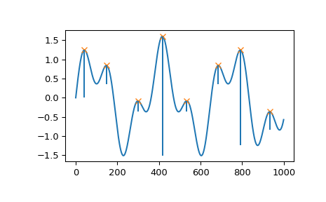
Step 4: Classify peaks on slopes
Some peaks live on the slope of bigger peaks, they are small bumps on a larger hill. These inherit the identity of their parent peak.
So, if the parent is SOUND, then this peak is SOUND as well.

Step 5: Remove outliers
After classification, any data points that fall under OUTLIER peaks are removed from the training data.

Removing minor outliers with DBSCAN
After KDE has removed all major clusters of outliers, we call DBSCAN to remove the individual outliers, outliers that are isolated from other data points.
DBSCAN stands for Density-based spatial clustering of applications with noise
Wikipedia says it best. DBSCAN does the following:
it groups together points that are closely packed (points with many nearby neighbors), and marks as outliers points that lie alone in low-density regions (those whose nearest neighbors are too far away)
To reiterate: DBSCAN is searching for data points that have few neighbors.
Rabbit hole: Turning a time-series into 2D coordinates
DBSCAN calculates distances to neighbors. For this to work, we need to convert the time series to 2D coordinates.
Our time-series has datetime on the x-axis and float on the y-axis, but we need float on both axes.
So, how does one change time into float? Spacing the data points more or less close together will have a measurable effect on the distance between data points.
If we put data points too close, then we are effectively lowering the importance of time. 2 outliers that happened hours apart might end up so close to each other that we consider them close neighbors, which means we won’t be able to successfully recognize them as outliers. But if we put the data points too far apart, then they won’t be able to connect to any neighbors and our algorithm will want to categorize everything as outliers.
After experimenting a bit, I decided that a good distance is std / 10. It’s conservative enough that we won’t be removing too many data points.
def _get_x_y_coords(ts: pandas.Series) -> numpy.ndarray:
    step = ts.std() / 10
    stop = step * len(ts)
    x = numpy.arange(0, stop, step)
    y = ts.values
    return numpy.array(list(zip(x, y)))
The DBSCAN algorithm needs just two parameters:
ε/eps: The maximum distance between two points for them to be considered neighborsmin_samples: The minimum number of neighbors a point needs to be part of a cluster

If min_samples = 5, a point needs at least 5 neighbors within eps distance.
I set min_samples to 12. I experimented with a variable value, a value that increases as the number of data points increases, but it made no difference. So, I left the value at 12 and moved on.
Rabbit hole: Finding the right ε
The eps needs to be chosen by us. DBSCAN can’t figure it out by itself. But how does one choose eps on the fly, customized for every data set?
If I choose a too small eps, everything will become noise. If I set it too large, then outliers get absorbed into normal data.
Luckily, a good eps can be estimated with the elbow method.
- We need to know the
min_samples, the number of neighbors we will count. As I mentioned, I use 12. - For each point, calculate the average distance to its 12 nearest neighbors.
- Sort these distances from smallest to largest.
- Plot them, and you will see an elbow in the curve, a bend. The location of the bend is our optimal
eps.

Points before the elbow have neighbors at similar, short distances. Points after the elbow have distant neighbors. The elbow is the natural boundary between “normal density” and “too sparse”.
However, this isn’t a foolproof method. I use the calculated eps, then remove the outliers and again compare the noisiness of the leftover time series. If I’m not happy with the result, I increase the eps and try again.
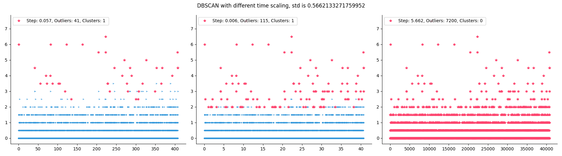
But one eps isn’t enough
Once eps is chosen, we run DBSCAN on our data.

Just as with KDE, there are built-in safety features. We check how much data was removed (identified as outliers) and what the noisiness of the remaining data is.
If more than 10% of data points are marked as outliers, we reject the result. 10% might seem little, but 10% of 1 day is 2.4 hours. If the metric spikes for 2.4 hours every day, then that is part of the normal pattern for this metric.
If the noisiness fell too far down, we also reject the result.
We run DBSCAN up to 2x. The 2nd time we increase eps, but leave the min_samples at 12. This makes DBSCAN accept more ex-outliers into “normal data”.
The new eps is halfway between the old eps and the max_distance observed in the data.
eps = (max_distance + eps) / 2
Post outliers: Health Classification
Now that we have removed all outliers we could find, we can pretend our data is representative of “normal” for this metric.
Our main goal wasn’t reached yet. Our goal is to classify the new data point we measured just now into healthy, ailing, or unhealthy. Now that we got rid of the outliers, we can finally see the “normal” data and set the health borders.
The whole process is thus:
- Clean the data: remove the major and minor outliers
- Set health borders: calculate the thresholds that separate healthy from ailing from unhealthy
- Classify new value: compare new value to those borders

Setting the Borders
We need to set two borders:
- Ailing border: the threshold between healthy and ailing
- Unhealthy border: the threshold between ailing and unhealthy
The Ailing Border
The ailing border is calculated as the maximum of two values:
mean + 3σ: this is our Naive Attempt 1, the classic statistical rule- 99.7th percentile: at most 0.3% of historical values should be above this border. This, however, is not a statistical rule, this is our own threshold that I set after experimenting.
min_by_std = mean + 3 * std
min_by_percent = numpy.percentile(clean_data, q=99.7)

ailing_border = max(min_by_std, min_by_percent)
Rabbit hole: If the same numbers repeat a lot, then numpy.percentile doesn't work as expected
For example, numpy.percentile([1, 2, 2, 2], q=90) returns 2.
But if we set the border at 2, then 3 out of 4 values would be marked as ailing. That’s 75%, not the 10% we wanted.
What we really want to achieve with percentile is to make sure only a small percent (0.3%) of values will be marked as AILING. In the above example, it is better if none are marked as AILING than if 75% are marked as such.
So after calculating the initial border, we check how many values are actually above it. If too many are above, then we increase the border to the value of the next data point above the old border. If none are above, then we just increase by 0.01.
We repeat this check up to 3 times, pushing the border higher until at most 0.3% of values are above it.

The Unhealthy Border
For the unhealthy border I kinda cheated. I just set it at the same distance from AILING as AILING is from the mean.
ailing_distance = ailing_border - mean
unhealthy_border = ailing_border + ailing_distance
This creates a symmetric structure: if ailing is 2 units above the mean, unhealthy is 4 units above.
Once we have the borders, classifying a new value is straightforward. If the new value is >= unhealthy_border it is UNHEALTHY, if it’s >= ailing_border then it is AILING, otherwise it is HEALTHY.
“More is Better” Metrics
We are here talking about server metrics. When I think of server metrics I presume the lower the values the better. But soon metrics appeared where “more is better”. The first such metric was The Number of Burst Credits, which of course we wanted to keep high.
For these metrics, the logic is just flipped:
- the ailing border is below the mean
- values below the border are considered
AILING
Putting It All Together
What we’ve built is a self-tuning anomaly detection system. Instead of asking you, the user, to choose thresholds, it trains itself to figure out what is HEALTHY. It also has the power to adapt. When your metric changes, because your traffic has changed or your system has changed, the algorithm calibrates new values for thresholds.
- Collect metric values every 2 minutes
- Check if the median is pervasive
- Remove major outliers with KDE on rolling averages
- Remove minor outliers with DBSCAN on the remaining data
- Calculate borders using
mean + 3σand 99.7th percentile - Classify each new value as
HEALTHY,AILING, orUNHEALTHY

The whole analysis runs in milliseconds. We cache the borders in Redis so we don’t recalculate them for every single metric value. The cache expires after 1 hour, ensuring the algorithm adapts to changing patterns.
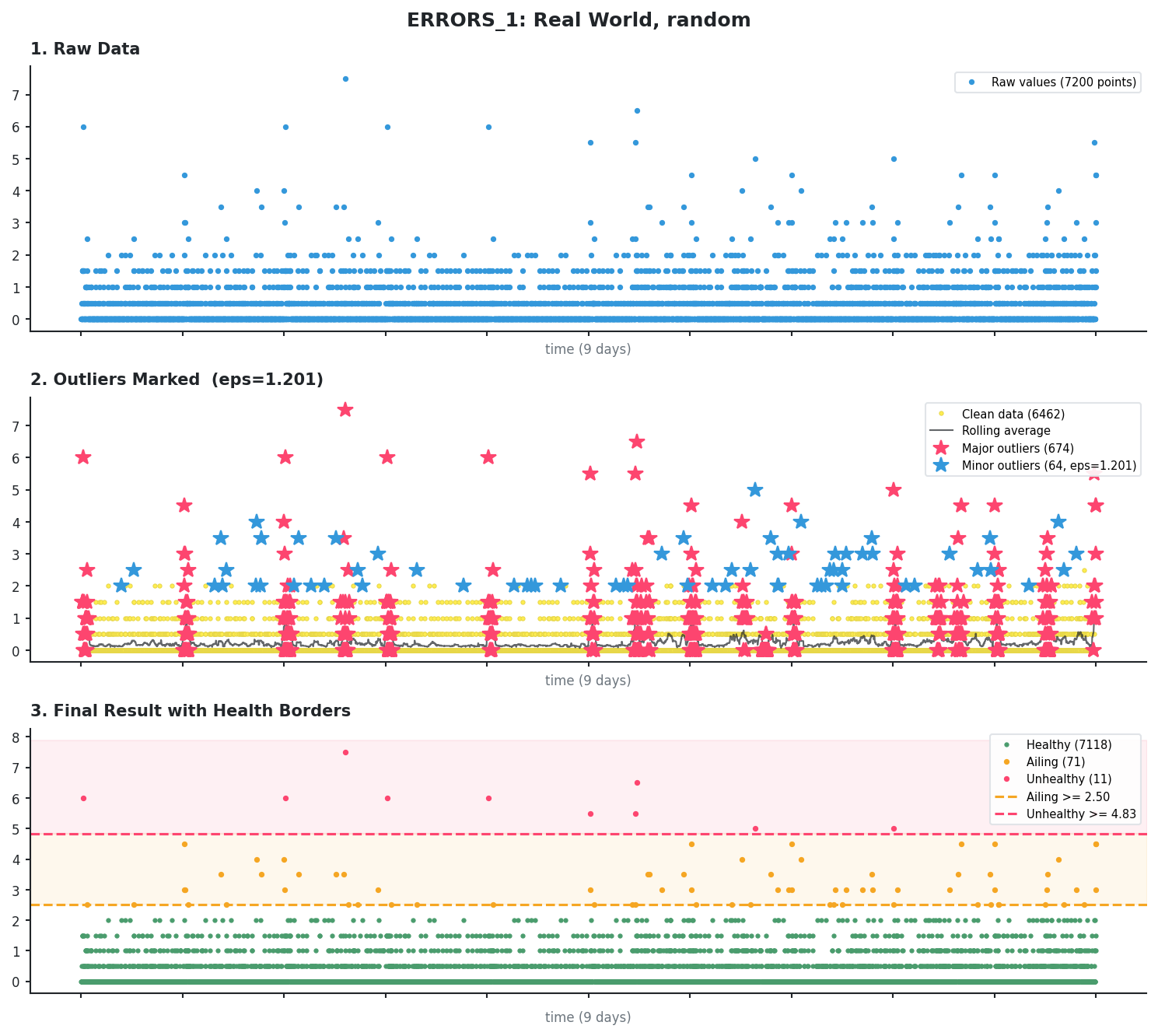
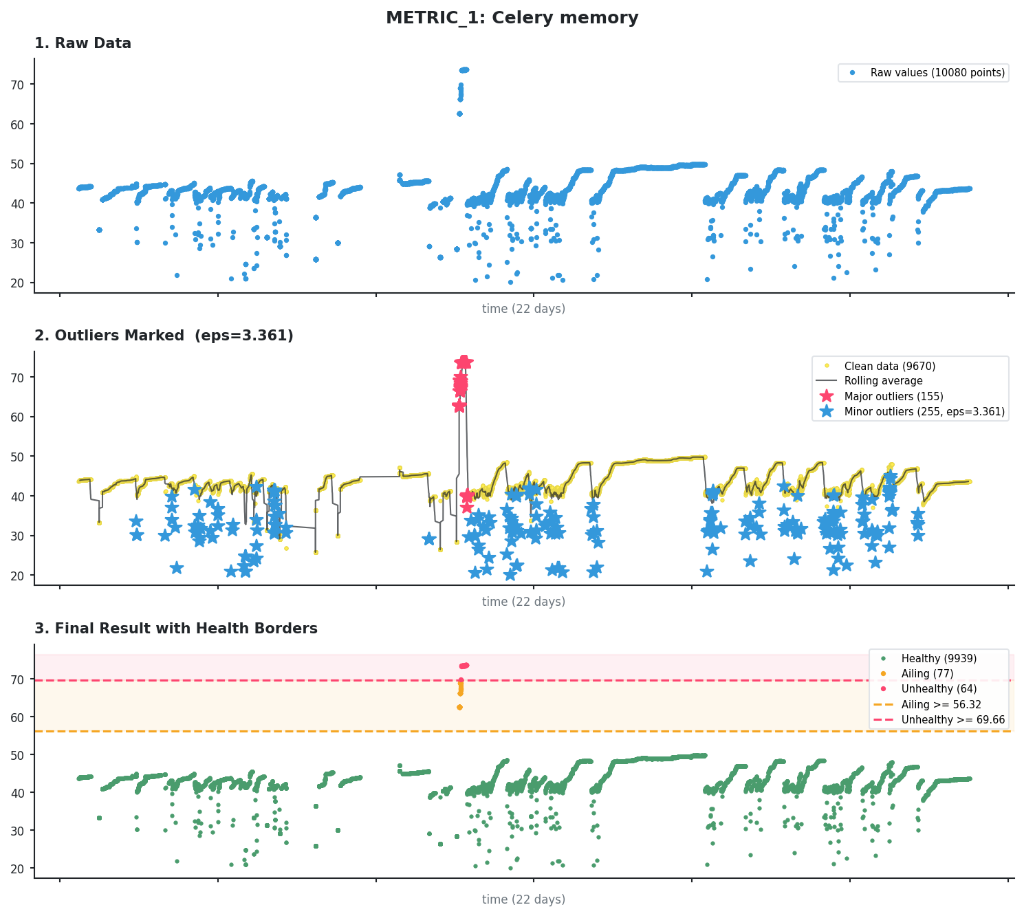
Real world examples of results
Here are some examples from real production data showing how the pipeline handles different patterns.
Every example comes with 3 pictures: the first is just the metric data, the 2nd shows all found outliers, and the 3rd shows the health borders.
Scattered error spikes
This is typical error data with scattered spikes throughout. KDE identifies the larger clusters while DBSCAN catches isolated points.
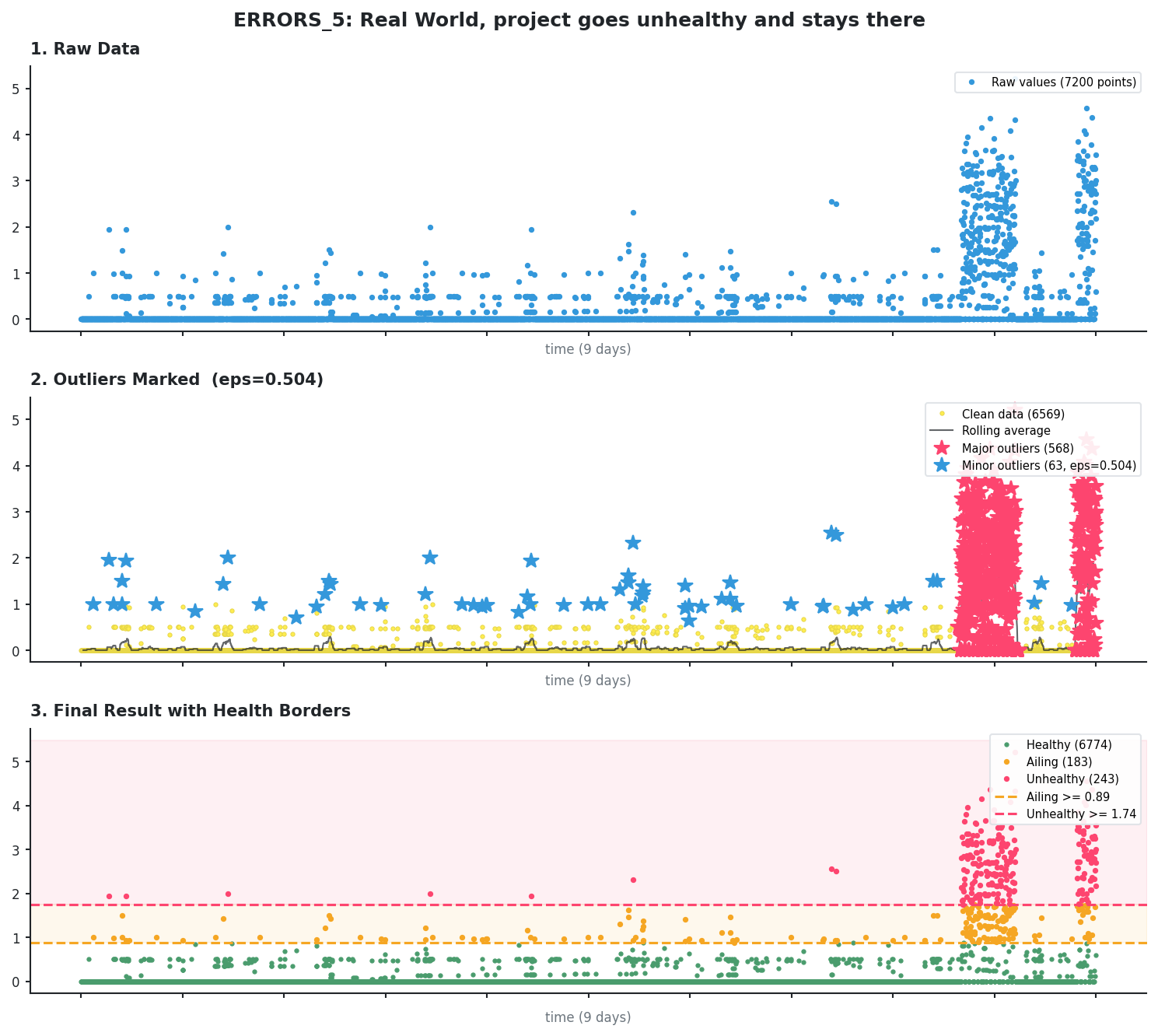
Continuous metric with incident
This is memory usage from a Celery worker. The algorithm finds 1 incident spike with KDE and removes it.
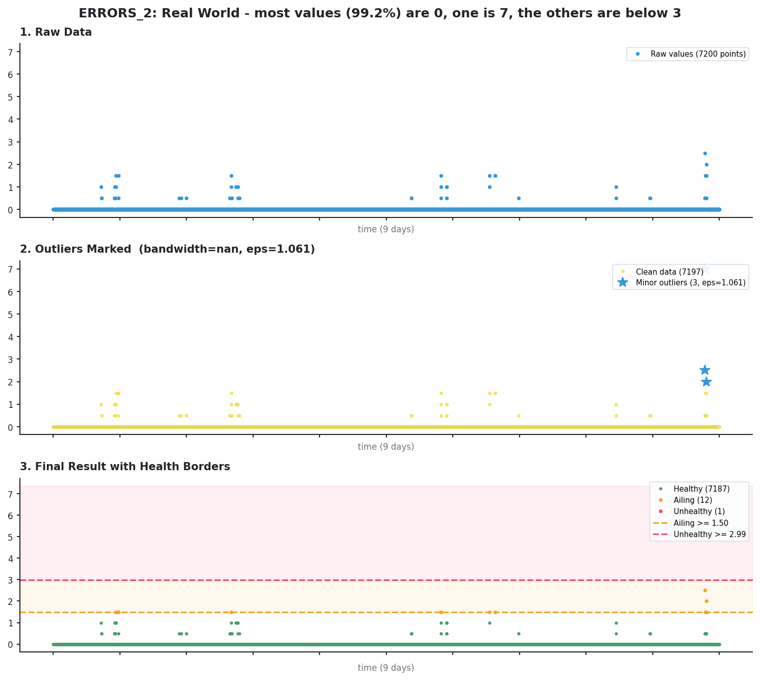
Pervasive median (KDE skipped)
When most values are identical (here 99.2% are zeros), the median is “pervasive” and KDE is skipped entirely. Only DBSCAN runs, catching the 3 isolated spikes as minor outliers.
Adapting to a changed pattern
The algorithm recalculates borders every hour, which means it can adapt to a trend change in the time series. Since we only allow up to a certain percentage of outliers, yesterday’s outliers can become today’s normal values.
Here is an example of a metric that changed its baseline.
Before (first 11 days): the baseline is pretty low, the outliers are clearly separated. AILING is >= 16.31 and UNHEALTHY is >= 30.32.
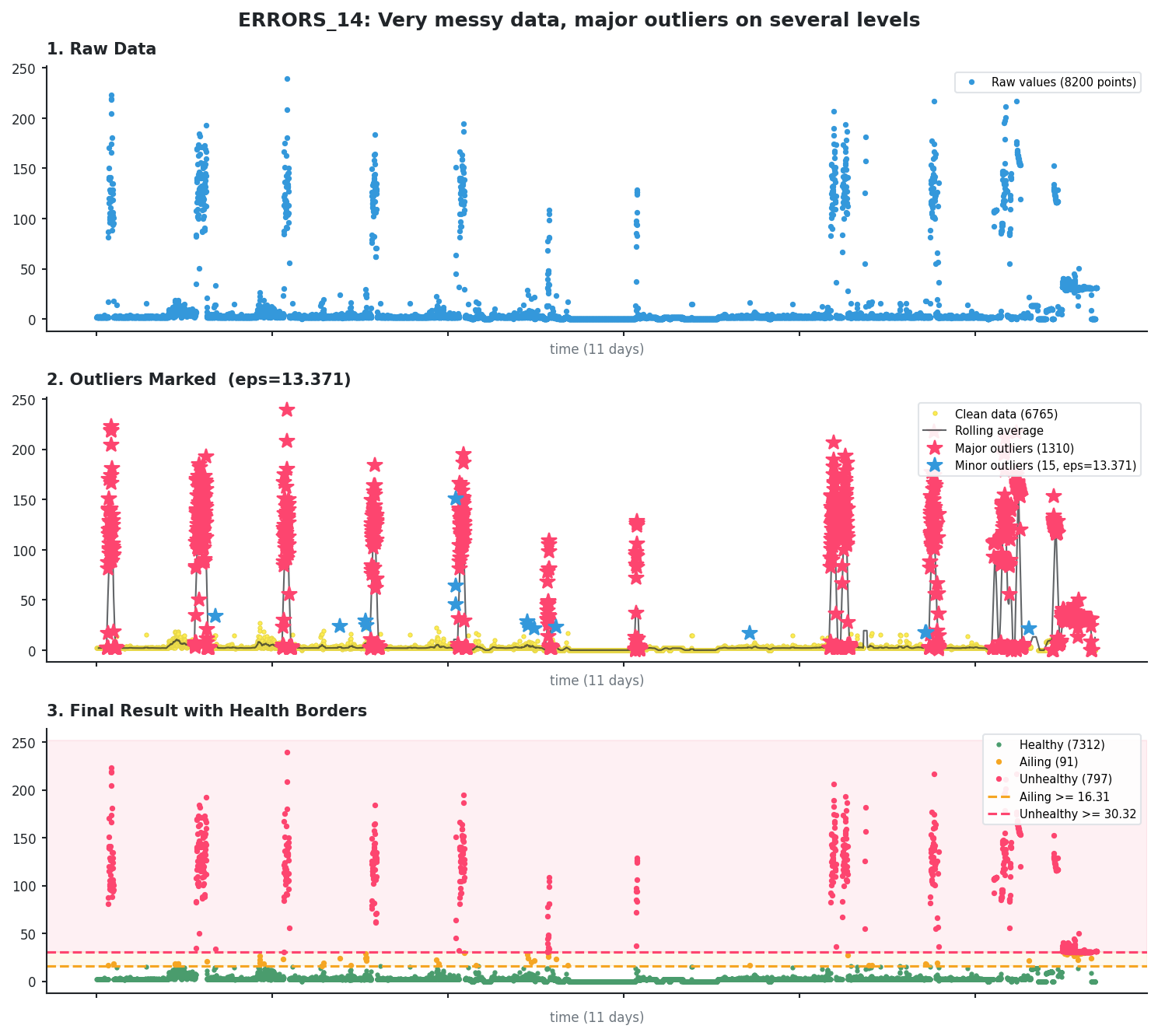
After (about 2 days later): we can see lots more elevated values. What were outliers 2 days before - the values in the 20-40 range - is now part of the normal pattern.
The new AILING is >= 61.80 and UNHEALTHY is >= 117.62.
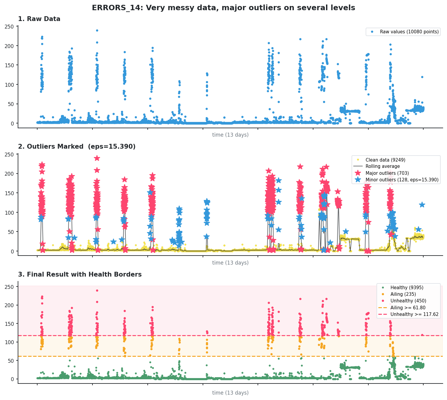
Sustained incident
Here we can see 2 significant incidents that lasted for a while. Still, KDE identifies them as outliers, not as the new normal.
External sources
- Normal distribution
- Standard deviation
- Interquartile range
- Kurtosis
- Kernel density estimation
- DBSCAN
- k-nearest neighbors algorithm
- Moving average (rolling mean)
- PyOD python library
- Quartile Calculator
- Elbow method (clustering)
- Topographic prominence
- Silverman's rule of thumb (bandwidth selection)
- Percentile
- scipy.signal.find_peaks
- scikit-learn NearestNeighbors
- Gaussian kernel (RBF)