Most of us have a very simplified mental model of statistics. We understand statistical statements like “the average of <something> is <this much>” as 100% true. They are math after all. If the average weight of the apples on my table is 200g, then that is 100% true. Math cannot lie.
Unfortunately, (or luckily?) life is just not that simple. Statistical facts hide the truth in creative ways. That is why it is soo easy to lie with data.
The following statements are true. But, they are also misleading.
- “Fewer traffic accidents happen on icy roads than dry ones.” Because much fewer people drive when the roads are icy, not because adding ice makes the road safer.
- “Old houses were built better, look how long they’ve lasted.” Because the poorly built houses aren’t standing anymore and cannot be counted.
- “Average salary at our startup is 300K.” Because our C-level is compensated really well, and they pull the average way up.
- “We have zero security incidents.” Because we have zero security monitoring.
- “Ana burns 40 million tokens a month, she’s clearly our most AI-forward engineer.” Or, maybe Ana pipes the production logs in raw. All of them… for the last 12 months.
Let’s learn how to lie with data… or how to spot the lie in data.
How to sabotage your competition with a dashboard
Let’s say we work at a company that likes dashboards. They gamify the dev work. We all like games after all.
There is this 1 dashboard that tracks change failure rate over time. To increase competitiveness among developers (which translates nicely into company profits) the values are measured per developer.
Surely, a developer who deploys less broken code and solves more failures is a better worker. Surely, tracking the number of rollbacks is good, and thus exposing developers who are sloppy with their changes and who deploy bugs is also good.
So, we’ve built this dashboard that rates developers by the failure rate of their code:
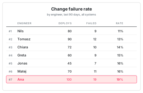
Clearly, Ana is our worst developer.
It’s true that she deploys a lot, the most of anybody, but sooo many of her deploys are faulty.
The metric is very clear and the mathematics behind it not complicated at all…. Ana made 100 deploys and saw failures for 19 of them. It’s not rocket science…
What could possibly be wrong with this conclusion?
The thing is… Ana is actually your most senior developer… And this is the only reason why you become suspicious of the dashboard’s results.
If the dashboard was showing Nils at the bottom of the list, you wouldn’t mind just firing him on the spot, you never liked that guy anyway, but Ana… you could swear she is your most productive engineer… what’s going on with this dashboard?
(This is why they say that it’s not enough to be correct in life, you also have to be liked, respected, valued to not get fired.)
But… what can we do to find the bug in this data?
Splitting data proves the opposite
Let’s split the failures into 2 categories, because not all deploys are the same. Some parts of your codebase are simple to understand and modify, others are convoluted and painful, stressful to touch.
So, you split up the failures into “low risk” and “high risk”. The “low risk” failures cost the company almost nothing, the best example is a bug in some internal tooling library. The “high risk” failures are the real, meaty incidents, they are problems with the payment system or the authentication. This is where the customers quickly notice and get mad.
So… who is best at the high risk failures?
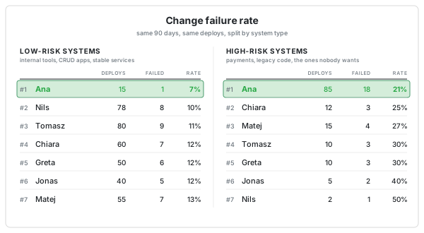
Well… weirdly enough… it is Ana!
So, Ana is worst at overall failure rate, but she is best in low-risk failure rate and in high-risk failure rate? This can’t be!
Run the numbers yourself. And you’ll see that the numbers check out. It is true, math shows that Ana has the worst overall failure rate, but the best one when it comes to low risk failures as well as high risk failures.
This is how statistics lies to you.
So, what is going on?
What’s the name of this magic?
This is called Simpson’s Paradox.
Simpson’s paradox is a phenomenon in probability and statistics in which a trend appears in several groups of data but disappears or reverses when the groups are combined.
And this is exactly what we saw: Ana’s results were best in both subgroups, both halves of data, but once the two groups were combined they were the worst.
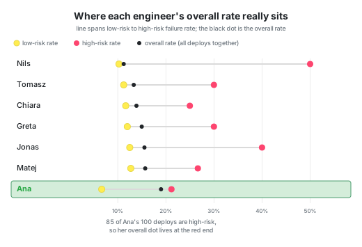
At least 2 things are to be blamed for this mess:
- The high risk and the low risk systems fail at different rates. High-risk systems fail at 21-50% for everyone, while low-risk at 7-13%.
- People don’t deploy into both systems equally.
As a senior developer, Ana, of course, mostly deploys into the high risk system: 85% of her deploys went into the high-failure pile. Everyone else mostly deploys into the low risk system.
The overall failure rate of every person expresses just as much the innate risk factor of each system as it does the bugginess of the author’s code. Because Ana mostly deals with the difficult code that others would rather avoid, her deploys fail more.
If you never leave your 3rd story apartment, it is very, VERY unlikely that a car will run you over.
Because the car would need to drive up the stairs first or would need to squeeze into the elevator to reach you high up in the 3rd story.
Ana’s average is pulled toward the 21% end because she mostly deploys into the high risk system. Nils’s is pulled towards the 10% end because he mostly deploys into the low risk system. The failure rate is actually defined by the system difficulty.
The overall failure rate isn’t measuring who deploys well, it’s measuring which code base you contribute to. But the reporting labels the column “failure rate” as if it’s measuring people’s skills.
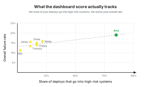
What we see here is the work of a so-called “confounder”, a hidden third variable that influences both things we are comparing.
We believed we were measuring person vs failure rate, but we were actually measuring “which codebase are you deploying into”. This inherent complexity of the codebase is the confounder that controls both other metrics “the person” (seniors deploy into the hard codebase) and “what your failure rate is” (hard codebases break more).
Smoking keeps you alive
People who study statistics know all about this paradox. People who deal with a lot of data are more aware of the dangers of confounders.
There are these famous survey results that definitively prove that smoking keeps you alive longer. Except, of course, it doesn’t.
However, if you knew nothing about smoking and health, and you thus fully relied only on the data collected in this survey, you would certainly pick up smoking and would go about convincing all of your friends to also start smoking in order to increase their life expectancy.
You probably don’t believe me, so, here’s the data.
In the early 1970s a survey was carried out in Whickham, England. They asked 1314 women about their smoking habits. Twenty years later, they wanted to follow up with these women. That is when they found out that 24% of the smokers had died and 31% of the non-smokers had also died.
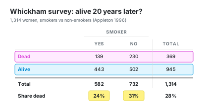
How is this possible?
What went wrong?
Did they just catch a weird section of the population?
Or maybe smoking really is healthy for women in particular? Or maybe specifically for English women?
Well…. it was… the age of the women questioned. In the 1970s, younger women smoked more than older women and over the next 20 years, it was mostly the older women who died.
Age was the confounder in this case.
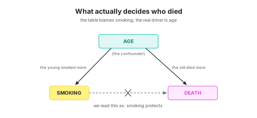
Age was the parameter that influenced when people died and also whether they smoked. It was young women who mostly smoked and young women who of course were still alive 20 years later.
If your job is to handle a lot of data, you will be taught about this paradox, because you have to know about the mines that are waiting for you. But, if data is just a side quest for you, a task you happen to get assigned, because your other work is finished, … then your chances of avoiding such mines are very slim indeed.
Decisions driven by data
Developers are taught about memory management, query optimizations, API schemas, concurrency issues… but very rarely about statistical traps.
If we never touched a metric nor a dashboard nor a rating, this would be fine. But, unfortunately…
From CEOs down to junior devs, we love ourselves a good dashboard, a good chart. Data makes it sound like the decisions we are making are well-founded and will thus stand the test of time and the test of users and the test of investors.
There is this whole, wide and deep scientific field that we refuse to dig into. We insist on building dashboards with averages and percentages and rankings, but we aren’t really interested in learning much about the inner workings of those calculations.
A faster page increased the average page latency
As I was researching this topic, I came across a blog post from 2012 by Chris Zacharias, a YouTube developer, who experienced Simpson’s paradox in real life. He took it upon himself to optimize the YouTube watch page: he got it down from 1.2MB and dozens of requests to 98KB and 14 requests.
He deployed the new and improved page to a fraction of the users and then waited a week for the metrics to accumulate.
The metrics showed that the average aggregate page latency had increased. The page was 10x smaller with 10x fewer requests, but the videos were taking longer to load.
The average page latency went UP.
It took a week of digging through the data to find the answer. The answer was … geography.
Because the page now loaded much, much quicker, it got more traffic. But the traffic was from parts of the world where the internet was much slower at the time. The traffic came from Southeast Asia, South America, Africa, remote parts of Siberia. The old page was unwatchable, because it took 20 minutes to load.
The new page loaded in about two minutes. Suddenly whole regions could actually watch a video, and they poured in. But with them came their two-minute load times that sabotaged the metrics.
Again: every existing user got a faster page, but the average load time went up.
What can we do?
So, what can we actually do? We can’t all get statistics degrees by next week.
There is no way to spot this paradox from the numbers alone. The aggregate table and the split table are both mathematically valid. Nothing in the data itself tells you which one is the truth.
That is why you can’t detect confounders after the fact, you have to defend against them upfront:
- You can randomize. If you randomly assign who ends up in which group, fewer hidden variables can correlate with the assignment. This is why proper A/B tests randomize users instead of letting them opt in.
- You can adjust. Nobody can randomly assign smoking, so epidemiologists report age-adjusted mortality rates, never raw ones. They split the data by the suspected confounder and recombine it with fixed weights. However, this only works if you already suspect that some property (age) matters.
- You can interrogate the data collection. Before reading a single number, ask: “Who ended up in this bucket? And how?” Did the people assign themselves? Did the population change halfway through?
- You can draw the causal diagram. What influences what. The diagram can help you figure out which variables you need to control for.
The problem is… for all of these solutions you need domain knowledge. You have to know the suspects before you can round them up.
And that is exactly what happened with Ana. The reason she didn’t get fired (in this hypothetical scenario) was that the boss knew the domain… he knew Ana. If nobody had gotten suspicious, the “objective data” would have labeled her as the worst engineer. Nobody was malicious here. It was just garden-variety ignorance.
Had the dashboard condemned Nils… who knows what would have happened. We are willing to dig deeper only when we care. The way we really do want to save the beautiful, strong polar bears and the cute, funny pandas from extinction but the ugly Titicaca water frog gets left behind.
Bad data doesn’t get corrected. Bad data about pandas gets corrected.
Math cannot lie. But it also cannot tell you what it is measuring. That part is on us.
Next chapter
⏭️ To be continued...